Shame on you, watchOS
How the latest watchOS update expected me to relearn ingrained behavior.
#17 · · readFor weeks, my watch annoyed me. It's time to update, it said. Your update did not finish, it said. It's time to update, it said again. Isn't it weird that we live in a time in which we need to update our watches?
Updates, of course, are part of modern life. There's no way around them. On the one hand, I want updates to just happen in the background. Since they are indispensable and happen all the time, I want to use my precious brain power on more significant matters. On the other hand, I want control. I don't want my devices making their own decisions. I don't want to wake up to a world where the operating system (OS) of my watch looks entirely different, and I wasn't involved in making this decision.
But in the end, do I really have a choice?
The update
Then, my watch has annoyed me one too many times and eventually, I did the update. Since I haven't been keeping up with developments in the Apple universe, I wasn't aware that this was a major one. An update, in which not only the version number after the dot increased, but the number before the dot. You know, the more important number. The part of the version number non-tech people sometimes talk about.
So, within a couple of minutes, watchOS 9 morphed into watchOS 10. Being the OS nerd that I am, I felt excited.
The new normal
You might have an idea what's coming next. After the update, I woke up to a world where the OS of my watch looked entirely different. And even though I was involved in making this decision, I didn't like this new world. They changed so many features that were never supposed to be changed. They took ideas of how we use watchOS and changed them completely, leaving us to relearn what we had once already learned.
An update that was supposed to make users' lives better actually made users' lives worse.
But since I'm aware of how the feedback burger works, I will start with the positive.
Smart Stack
So, they made a new thing. If you're on the watch face and turn the Digital Crown, you can see widgets now, that are not only helpful, but also context-dependent. You might see an airplane ticket from your wallet, if you are travelling.
In my case, I can see that I have a barbershop appointment with Sami from my calendar.
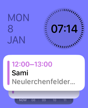
I like this new feature, and believe it's something that has been missing from watchOS up to that point. So far so good.
Control Center
There's nothing that they changed about the design of the Control Center itself. But they did change on how to open it.
Before the update, if I swiped up from the watch face, the Control Center would appear showing me things like connection status, battery power or find my phone (an underrated feature that I use way too frequently).
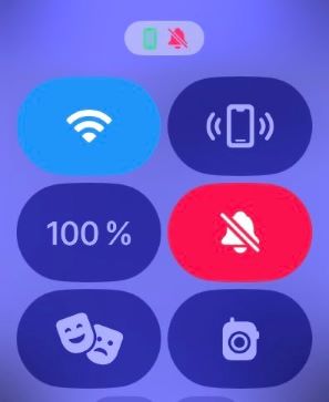
After the update though, if I swipe up from the watch face, the Smart Stack appears. What happened? They changed a well-known interaction among watchOS users. Ever since I got my Apple Watch 2 years ago, I've been swiping up to view Control Center. And now this.
The day of the update, I was about to go to my workout and wanted to check the battery status of my watch. So I swiped up, as I've always done: but Control Center wouldn't show.
I actually had to look this up online to figure this out, because Apple's design decision confused me so much.
They could have stuck to the known and learned interaction of swiping up from the watch face. Why not have the Smart Stack accessible by turning the Digital Crown only?
App Switcher
In the past, I used the side button to switch between apps. But now, that the side button is reserved for the Control Center, how do you launch the App Switcher? You are not gonna like this.
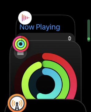
If you want to switch between apps in watchOS 10 you now have to double tap the Digital Crown. This frustrates me for 2 reasons:
- As you can guess, I don't want to relearn how to switch between apps.
- Double tapping the Digital Crown feels clumsy to me. When I do the interaction, sometimes I'm not tapping fast enough, and I have to try again.
I use the App Switcher frequently and have to say that this design decision made interaction a lot less intuitive.
Locking the watch during workouts
Only recently, I've discovered how smart the "Water Lock" function is. I've always believed it's just there to remove water from the speaker, after taking a swim. But there's a side effect: Once you activate Water Lock, your Apple Watch is locked (hence the name), making it unresponsive to user input. So if I accidentally tapped the screen, my watch wouldn't react.
This, of course, is especially useful during workouts. It has happened to me a couple of times during boxing workouts that I finished my workout too early because I wear my boxing gloves over my watch. If I lock my watch during the workout, I can prevent this from happening. But guess what, they removed the Water Lock feature during workouts.
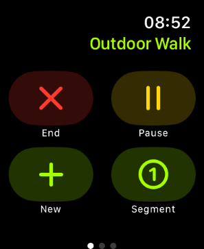
Why did they do it? It made so much sense for it to be there. Now I have to lock my watch from Control Center, and you can imagine how many tries I need to get there in the first place (see above).
Other side effects of the update
Another side effect I have witnessed: my home screen layout was reset. I use grid view and spent some time arranging all my apps by color. Ever since I did that, I've learned which app to find where. With the update, they reset the home screen layout and I have to realign everything.
My favorite complication on the watch face also doesn't seem to work anymore: The time of sunset/sunrise, but I have no proof that this is related to the update.
Learning vs. Relearning
The reason why I'm so annoyed with this update is as simple as this: Users hate change.
I'll have Jakob Nielsen, aka "Mr. Usability" himself explain what he thinks about redesigns:
So, you know that this design is actually more efficient for users, and it's easier to learn. Well, user testing show us it's easier to learn for new users, but for the old, existing users, the old design is what they know. So, for them, any change is something new they have to learn. People just don't like to spend time learning. They want to spend their time doing. So that's why they're going to be complaining.
Oh yes, I'm complaining. And in the case of watchOS, I even doubt that Apple concerned themselves with the first part of what Jakob Nielsen said. How did they decide that these changes are more efficient for users? I think having to double tap the Digital Crown at all or removing the Water Lock feature are plain and simple bad design decisions.
Jakob goes on:
The best way to actually reduce the problems with change is to reduce change, and not having so many changes by shipping a really great design in the first place. So do a lot of UX work to really polish and redefine a really, really wonderful, best possible design that you launch in the first place.
Amen.
Here's the breakdown:
- For at least 5 generations (or since 2018) users have been swiping up to access Control Center.
- For at least 5 generations (or since 2018) users have been switching between apps using the side button.
- I don't know for how long locking your workout has been part of the Workout app, but I can see that other users are complaining about this change too.
I love my Apple Watch. I love watchOS. But this update really annoyed me, and I'm not sure how this could have happened. Of course, I will get used to this new normal. But was it really necessary to upset me in the first place?
Shame on you, watchOS.