Frustrations with Morgen
The world needs to know about my new calendar app.
#31 · · readEvery once in a while, software upsets me so much that I have to reflect on my frustrations by writing about them.
Just like watchOS did a while ago, recently, my new calendar app has been annoying the shit out of me.
Letting go of my anger by writing about it feels very soothing. You should try it too.
Goodbye, Apple Calendar
For over a decade, I've been a happy user of Apple's native calendar app. On macOS, on iOS, heck sometimes even on watchOS! But then, something changed. In the beginning of this year, I returned to Windows. As a consequence, I had to change old habits.
No more Apple Calendar.
I could have used the web UI of Fastmail's calendar. But I'm a desktop calendar app guy, so that never really worked for me. I could have used Thunderbird, which does have a desktop app on Windows. But apart from taking forever to sync it's also cumbersome to use.
And so, Morgen entered my life.
The promise
Morgen is a calendar app. But not just any calendar app! It integrates with my favorite to-do list app, Todoist. There's more! It allows me to sync my Fastmail calendar. Aaaaaand it's cross-platform.
It runs on iOS, macOS, even on Linux! Most important for me: it runs on Windows. Last but not least, it has a German name (Morgen means "morning"). And that is very cool, of course.
So obviously, I had to get Morgen. I didn't hesitate to sign up for the 80 euro yearly subscription.
All I thought was:
What can go wrong?
Little did I know that so much can go wrong.
Dealing with events
A lot of my frustrations with Morgen revolve around displaying, rescheduling and creating events.
Declined events
One of the first things I noticed when I started using Morgen was that it displayed declined events in my calendar. In my case, a weekly repeating event, that I declined 4 months before. I checked my settings. The option to "show declined events" was unselected. So I declined the event again. It felt weird that I had to go this far. But after that, the world seemed okay.
But of course the world wasn't okay. Soon after, the event just reappeared. This only seemed to happen on iOS, so in an attempt to fix this, I logged out of the app and logged back in and suddenly, the event didn't show up again.
Until it did. But only in the widget on my home screen.
Then one day I woke up and thought to myself:
If Morgen tries so hard to show this declined event, let it.
I'm not gonna get annoyed by it anymore.
Rescheduling an event
Again, I was working with a repeating event. In particular the monthly date night with my girlfriend that had her as an attendee. When we couldn't make the date night for the Wednesday in question because we got ill, I rescheduled it for the following week. And again, the world seemed okay.
But what did Morgen do? It created a copy of the original event. So now, it displayed the original event of that Wednesday and the new event on the following Wednesday. I thought I was going nuts.
To be sure, I checked in Fastmail if it was duplicated there too. It wasn't. Only in Morgen's iOS and Windows apps. So I deleted the original event, but I had to do that 2 or 3 times before it eventually disappeared. Or so I thought because the next day it just returned.
Around this time, a thought crept into my mind:
Maybe I should have tested the app more thoroughly before committing to the Pro plan.
Oh yes, I should have.
Network error when creating an event
To be fair, I'm currently on a Philippine island (Siargao) that famously has problems with internet connectivity. Still, something was really odd about this:
- I tried to create a multi-day event.
- It gave me a network error.
- I checked whether my internet was working by opening a random website.
- It loaded without problems.
- So I tried creating the event again.
- Same result.
- So I closed all apps and restarted my phone.
- Internet connectivity seemed to work, so I tried for the third time to create the event.
- It failed again.
- I switched over to Fastmail and tried to create the event there.
- It worked immediately.
Morgen, Morgen, Morgen.
Speed
Morgen is slow on so many levels and that is annoying for so many reasons.
Sync
There are 2 arrows to manually sync your calendar in the top right of the UI. They also spin whenever they sync my calendar. And it feels like these arrows are constantly spinning. Is there really so much data flow required of a basic calendar app?
Unresponsive
Every time I open up the desktop app, I can't interact with the UI immediately.
I need to wait a couple of seconds before any input from my end is accepted (such as pressing „M“ to switch to the month view). And yes, seconds is quite a long time frame in 2024.
Offline
Last but not least, Morgen doesn't work offline. Is every user always online when they plan their life's events? I gotta tell you: I'm not.
Event details
This concerns the event details view, where Morgen is making it very hard for me to edit specific details of an event on iOS.
Change time zone for event
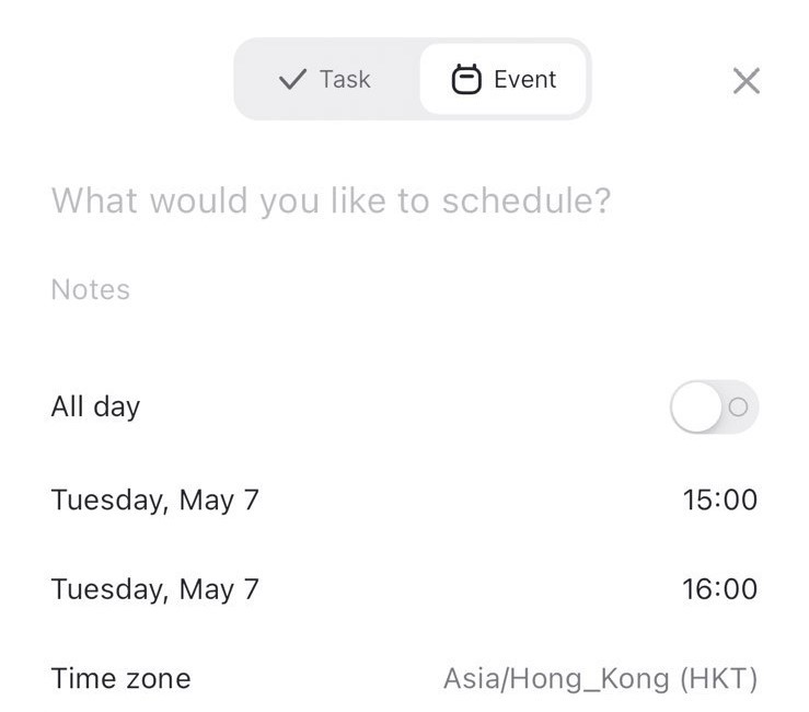
This doesn’t work or I haven't figured it out. I'm travelling and sometimes need to change the timezone of upcoming events. It's displaying a control for the timezone, but I can't seem to change this setting.
Why Morgen?
Make event repeatable
Unlike with the timezone there isn't even an option for me to create a repeatable event.
What a life.
Add attendee
I can add attendees when I create an event. But somehow I can't add attendees to an event I had already created prior.
Touch target size
I noticed when creating an event that sometimes my finger input wouldn't be accepted:
- I just tapped on that starting date, didn't I?
- I just selected a different calendar, right?
- Didn't I just tap on that time zone control?
The touch target size of many controls is very small, or it's not clear to me, what I can and what I can't tap.
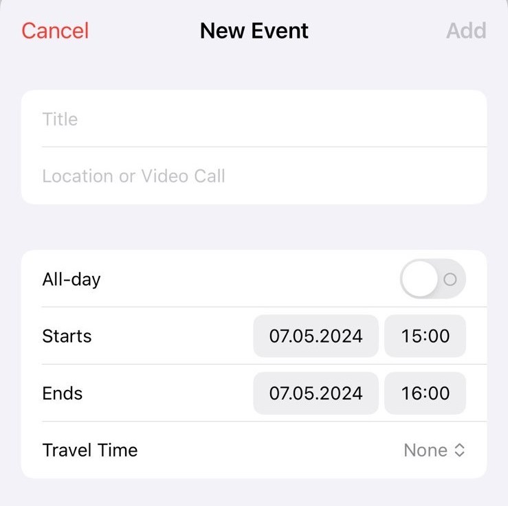
In Apple Calendar, it's obvious that the controls are clickable on the right side. The start and end time controls for instance have a clear gray background, indicating that they are clickable.

Moreover, you don't even have to directly click on the specific controls. I could also just tap the label "Starts" for the date picker to open. The touch target size is quite generous.
In Morgen, I have to directly tap on the day when I want to set a start or end date.

I might have grown quite accustomed to how Apple handles touch target sizes.
In any case, I'm convinced that Apple Calendar's design is superior.
I actually missed an event thanks to Morgen
I was very close to not publishing this post, because I felt like there was a lot of negative energy. But then this happened. I actually missed an event thanks to a UX problem.
Here's what happened:
- I opened the Calendar view settings.
- I hid my main calendar to show only events from a specific calendar.
- I returned to my regular life.
- The widget on my home screen now also hid my main calendar (obviously without me noticing).
- All day I have been looking at my home screen and Morgen just kept on happily announcing "No more events 🙌".
- I missed my event that evening.
That was the last straw. I had to publish this blog post.
The Morgen Calendar
The thing with Morgen is that I want to like it. I really, really, really do.
And many times I tried to convince myself, that it's not Morgen, it's me. It probably had a bad day. But after everything that has happened, I lost my patience.
See, for me a calendar app just has to work. I need to work efficiently and life is so much about managing your time.
Sometimes when Morgen fails me I just think:
Oh, come on Morgen, stop fooling around and finally send me the link to the working version of your app.
But then I remember that this is no beta release, no April fool's release, no demo. This is the real thing. They ask money for this! And it's not little.
I'm not mad. I'm just disappointed. 😔

