Labelling the Web 2
How to make the web experience less confusing for everyone.
#15 · · readI have been living in a bright, modern, 2-room apartment for over 2 years now. It's on a busy street in Ottakring, Vienna's 16th district, but since it's facing a nice inner yard, it's incredibly calm. Everything about my apartment is amazing. Except for one thing.
Only weeks after I moved in, I discovered the problem. The problem with my bathroom ventilation.
My bathroom ventilation is supposed to be smart. So smart, that it turns on automatically, once the humidity reaches a certain level. It could be while I'm in the shower, that my ventilation all of a sudden decides to turn itself on. But once it's on, there is no way for me to turn it off. Even if — at least in my perception — the humidity is on an acceptable level again. Even if I use the switch, it just won't turn off. So actually, it's not very smart.
Whenever this happens, it's up to the great bathroom ventilation gods to decide whether enough humid air has been sucked out of my bathroom.
The fuse box problem
Of course, I cannot accept my household devices patronizing me like that. When this happens, and I badly need to go to sleep without that annoying sound rushing in the distance, I take matters into my own hands.
And since I haven't found a proper solution, taking matters into my own hands means walking to my fuse box and turning the power in my bathroom off. It's a brutalist approach, I know.
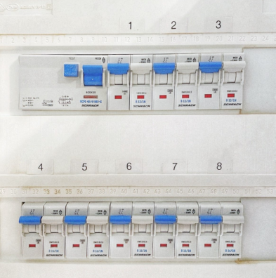
But when I stand in front of my fuse box, another problem presents itself. The switches of my fuse box panel aren't labelled, leaving me to guess what switch connects to what room.
This is confusing. What the hell am I supposed to do here? Trial and error? Turn all switches off? Bear through the sound and wait until it turns itself off again?
If I wanted to break down the fuse box problem, it's this:
There are no labels.
Welcome to the sequel of Labelling the Web.
Unlabelled user interfaces
You might ask yourself if the problem of unlabelled user interfaces (UIs) is only related to fuse boxes. And the answer won't surprise you. It's widespread across the web.
To demonstrate what this means, I want to use the header of a particular website as an example. There is an Austrian film festival that I have disguised enough so that no one will recognize it. Except (most) people from Austria probably will.
Let us call this Austrian film festival "Finale".
Next, let us take a peek at the header. If you have used the web before, this header will confuse you. The header of my semi-fictional film festival's website consists of a word mark, 2 elements on the left side called "button", 6 elements on the right side called "link" and another element called "German".
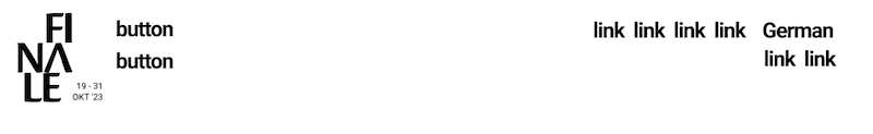
This is confusing. What the hell am I supposed to do here? Again, I'm reminded of the fuse box problem:
There are no labels.
What's this about?
It's all about perception
I admit it, this was an attempt to confuse you, yet again. The example doesn't actually show Finale's visual perception, but it shows Finale's screen reader perception.
If you aren't a user of a screen reader you will witness a different header. This different header consists of a word mark, 2 icons on the left side represented by three horizontal lines and a magnifying glass, a navigation area in the middle with various labelled elements, and 6 icons on the right side, represented by icons of social media platforms, a key and a shopping cart.
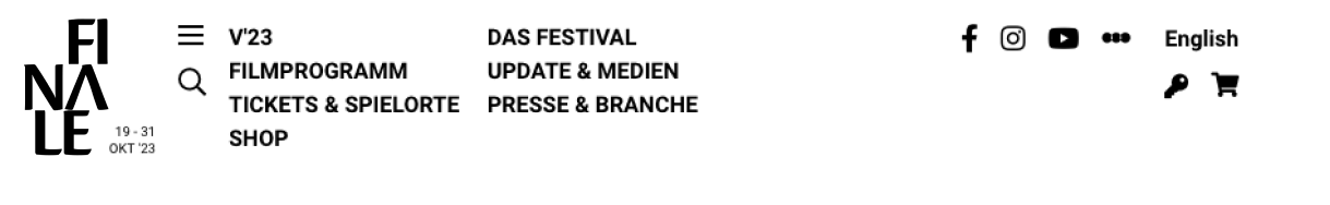
In the end, since it's the same website, it's also the same header. But it doesn't work for all users.
If you compare the two screenshots, you will witness two things:
- The designer did not label the icons for screen readers. Since screen readers can only work with text, they will only perceive loose containers and their respective roles, such as button or link.
- The designer managed to hide the entire navigation menu for screen readers. As a consequence, you can't navigate this website's content if you use a screen reader. What the actual fuck?
I decided to use Finale's example because it demonstrates the impact unlabelled UIs have on the user experience of the web. But the issue is bigger than that.
That is why I split it up into 4 individual problems:
- Designers don't label non-text elements.
- Designers use placeholder text to label form elements.
- Designers don't remove redundant labels from non-text elements.
- Designers don't test their user interfaces with assistive technology.
When I talk about "designers" in this blog post, I refer to teams that build software. We are all designers, no matter if we work as project managers, product owners, developers, testers or UI/UX designers.
Designers don't label non-text elements
We have established that icons can cause problems with perception if they are not labelled. But there's more. Icons and images are pixel- or vector-based. While we can process these elements visually, there is no way for a screen reader to do the same. Text is the most important currency on the web. All users can work with it.
Apart from graphics, other UI elements benefit from labelling such as dialogs, tables, toolbars or page titles. In this context, we need to talk about the concept of accessible names.
Accessible names
If you remember the first part of this article, you are familiar with accessible names. This time though, I want to use a different definition.
The MDN Web Docs defines accessible names as follows:
An accessible name is the name of a user interface element [...] They convey the purpose or intent of the element. This helps users understand what the element is for and how they can interact with it.
Accessible names aim to make UI elements perceivable for assistive technology by giving them respective names. Some elements that are purely text-based have an accessible name built-in.
Let's take a look at a few examples.
Links
Links usually have a visible label provided in text form.
In the following example of Herman's blog we look at the accessible name of one of their blog posts. Of course, I picked "Motherfucking Blog" to illustrate my example, because the post is hilarious.
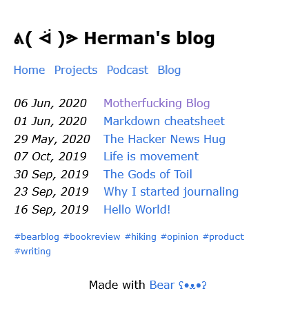
The accessible name of the link "Motherfucking Blog" is "Motherfucking Blog". In a screen reader's menu, showing all links, the accessible name will be shown as is. Of course, the same is true for other links on Herman's site. Home, Projects, Podcast, Blog, and so on.
If links only contain text, you get accessible names for them out of the box.
Buttons
Buttons, like links, usually have a visible label provided in text too.
In this example of Netlify we look at the accessible name of one of the buttons on its landing page.

The accessible name of the button "Request demo" is "Request demo". Similar to the link example, if you opened up a screen reader's menu and listed all form elements, the accessible name will be shown as is.
Same as with links, when buttons are purely text-based you get accessible names for buttons out of the box.
Icons
Icons are graphical elements that are present in non-text form.
We stick to the Netlify example, where we can see a magnifying glass icon (supposedly for search) and three horizontal lines (supposedly for menu) in its header.
If we don't provide accessible names here, these icons will be left unlabelled. Depending on the designer's technological preference, screen readers will then output a file name, a CSS class name or a weird set of characters.
You don't get accessible names for icons out of the box.
Images
Images, like icons, are graphical elements that are present in non-text form. Alternative text (or Alt text) is the most popular example for accessible names that many creators on the web are aware of.
By default, images don't have alternative text. It's something designers intentionally have to add. Since images are technically similar to icons, you will face the same consequences, if you don't provide accessible names.
As such, you don't get accessible names for images out of the box.
Dialogs and beyond
There are even more UI elements that can be labelled. Dialogs should have names too. They act as a summary for visual and screen reader perception alike. Cookie banners sometimes pop up as full-sized modal dialogs, asking the full attention of users. Filled with several paragraphs of legalese, you can make users' lives easier, if you sum up the dialog with a visual title that can also be used as a neat accessible name.
Labelling dialogs is similar to labelling page titles. Page titles act as a summary of what users can expect to find on a page. This way, you can also label tables, form controls, figures, frames, toolbars or landmarks. There are so many UI elements you can label.
Design tip
If you want to make your non-text content accessible, do the following:
Always provide accessible names for non-text elements.
Because you don't want to confuse your users and have them guess what a UI control does.
Designers use placeholder text to label form elements
Forms offer yet another opportunity for designers to mess up their labelling. A particular bad design pattern is widespread across the web. Designers sometimes can't resist the temptation of using placeholder text to label form elements.
The attentive reader of my blog remembers Web Forms for Everyone, where I talk about avoiding placeholder text altogether. This is me paraphrasing my past self (feels great):
Placeholder text isn't a proper label. It disappears as soon as users start filling an input field. At that moment, users might forget what they were supposed to enter. This becomes especially frustrating, when placeholder text is used to show the expected format of an input such as a date format (e.g. DD.MM.YYYY). In order to reveal the placeholder text again, users have to delete their typed input. How annoying!
Design tip
If you want to make labels and input hints in forms visible at all times, it's clear what you need to do:
Always use visible labels for form elements.
Don't rely on placeholder text.
Designers don't remove redundant labels from non-text elements
Sometimes designers decide to come up with a combination of icons and text. An example of this are buttons that have a visible label but use an icon too. This can support users in identifying a button's purpose. Also, it can confuse screen reader users, if the icon is weirdly labelled. Unlike our first problem, where designers don't label icons at all, now we focus on the opposite.
If you want to book a show at Graz Opera, you will have to deal with this great design invention.
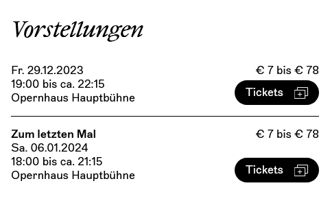
While it's controversial whether this particular icon in our example actually helps to understand the function of the button, it has a much worse problem. For reasons unknown, the icon has an accessible name that reads "Oper Graz Logo". Combined with the already present label of "Tickets", the accessible name of the button reads "Tickets Oper Graz Logo".
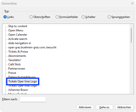
If you opened up the screen reader menu to show all links, two links with this confusing label will turn up.
The designer decided to provide an accessible name for the icon, when instead they should have hidden the icon for screen readers. What appears to be a careful design decision, since this is the official website of such a fine establishment, turns out to be yet another labelling problem. It's particularly confusing, because the icon has such a weird name. I mean, that's not even the logo of Graz Opera, why would they call it that?
Design tip
If you want to avoid confusing your users with redundant information, it's clear what you need to do:
Always hide redundant visual information for screen readers.
Similarly, images or emojis are sometimes only used as decorative elements that should be hidden from screen reader users as well.
Designers don't test their user interfaces with assistive technology
Last but not least, the biggest of all the labelling problems is this one.
There are 2 methods to check for accessible names on the web. Using the Accessibility inspector or using screen readers.
Accessibility inspector
Every browser offers some kind of Accessibility inspector.
In Firefox, right click any element, and select "Inspect Accessibility Properties." The Web Developer Tools will open up and show the Accessibility Tree, a hierarchical representation of the page's content and structure. You can check the accessible name inside the tree or inside the "Properties" panel.
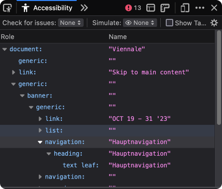
If you check Finale's Accessibility Tree, you will find that its navigation area is properly labelled, but there's nothing inside, except for a heading with a redundant label. The designer chose to hide the entire navigation area from screen reader users.
Chrome users can check for accessible names by selecting an element, choosing "Inspect" and then switching to the "Accessibility" panel inside the "Elements" panel.
Screen readers
Using a screen reader is the most reliable method to check websites for accessible names. With screen readers, you can experience for yourself if assistive technology is able to perceive your content exactly the way you imagined.
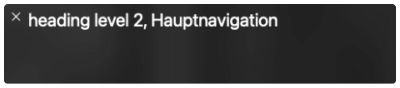
If you used a screen reader on Finale's website and put the focus on the navigation area, you will come to the same result as with the Accessibility inspector. A heading labelled "main navigation" is all you get.
Screen readers usually have a visual output, so you are able to see what the screen reader would read out to users.
Design tip
Screen readers are part of modern operating systems. macOS uses VoiceOver, Windows uses Narrator, Linux distributions with GNOME use Orca.
So what are you waiting for:
Always test your user interfaces with screen readers.
If designers regularly tested their UIs with screen readers, the web would be a better place.
Label your shit
If you follow the design tips I've shared in this post, I'm hopeful, that the web can be a better place for so many users.
Here are my tips if you want to join the cause:
- Always provide accessible names for non-text elements.
- Always use visible labels for form elements.
- Always hide redundant visual information for screen readers.
- Always test your user interfaces with screen readers.
My ventilation problem of course wouldn't be solved. But at least we can solve the fuse box problem and give me the satisfaction of turning off my bathroom power with self-sufficiency. Together.
Let's pull out our label makers and label the web. 😎